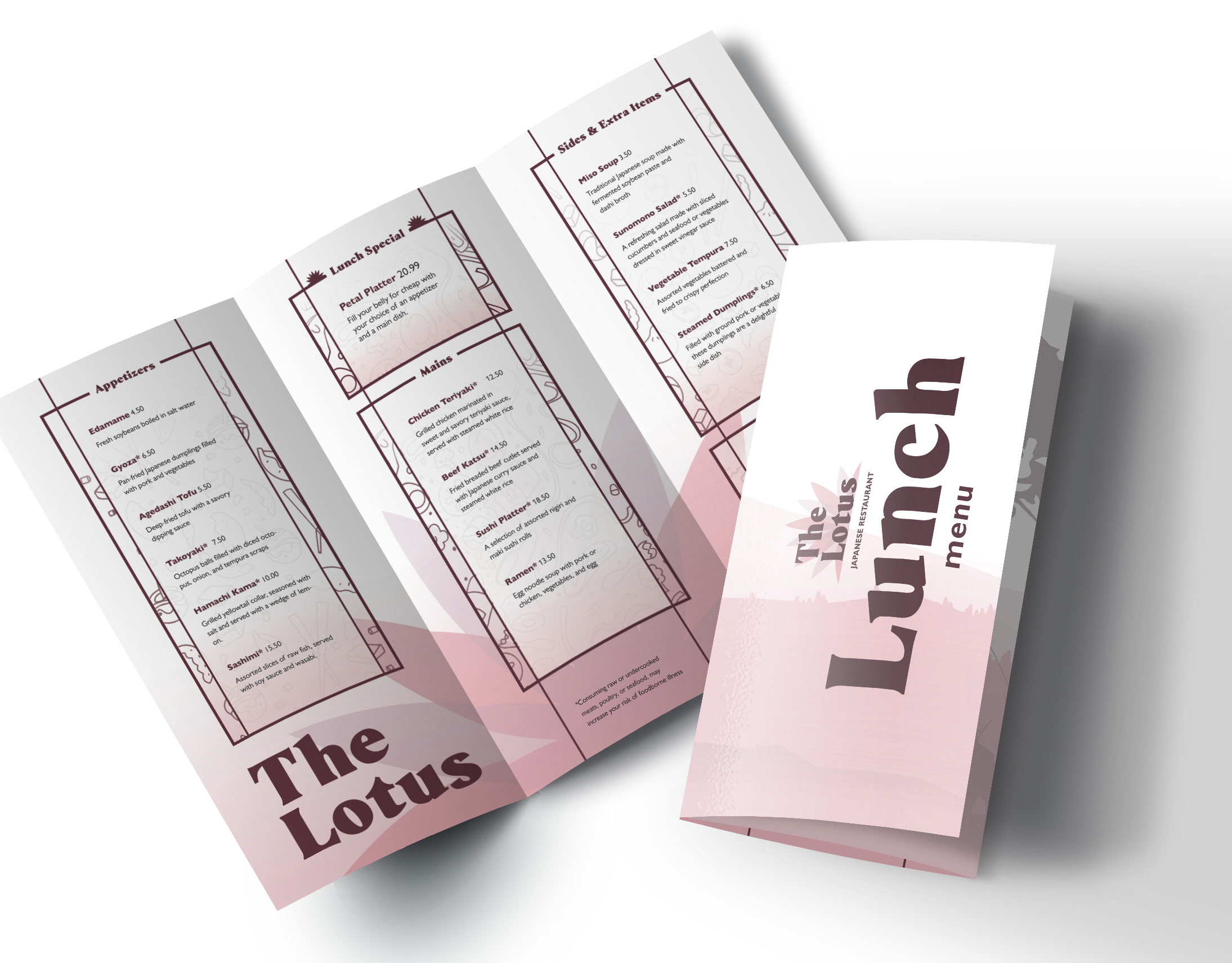
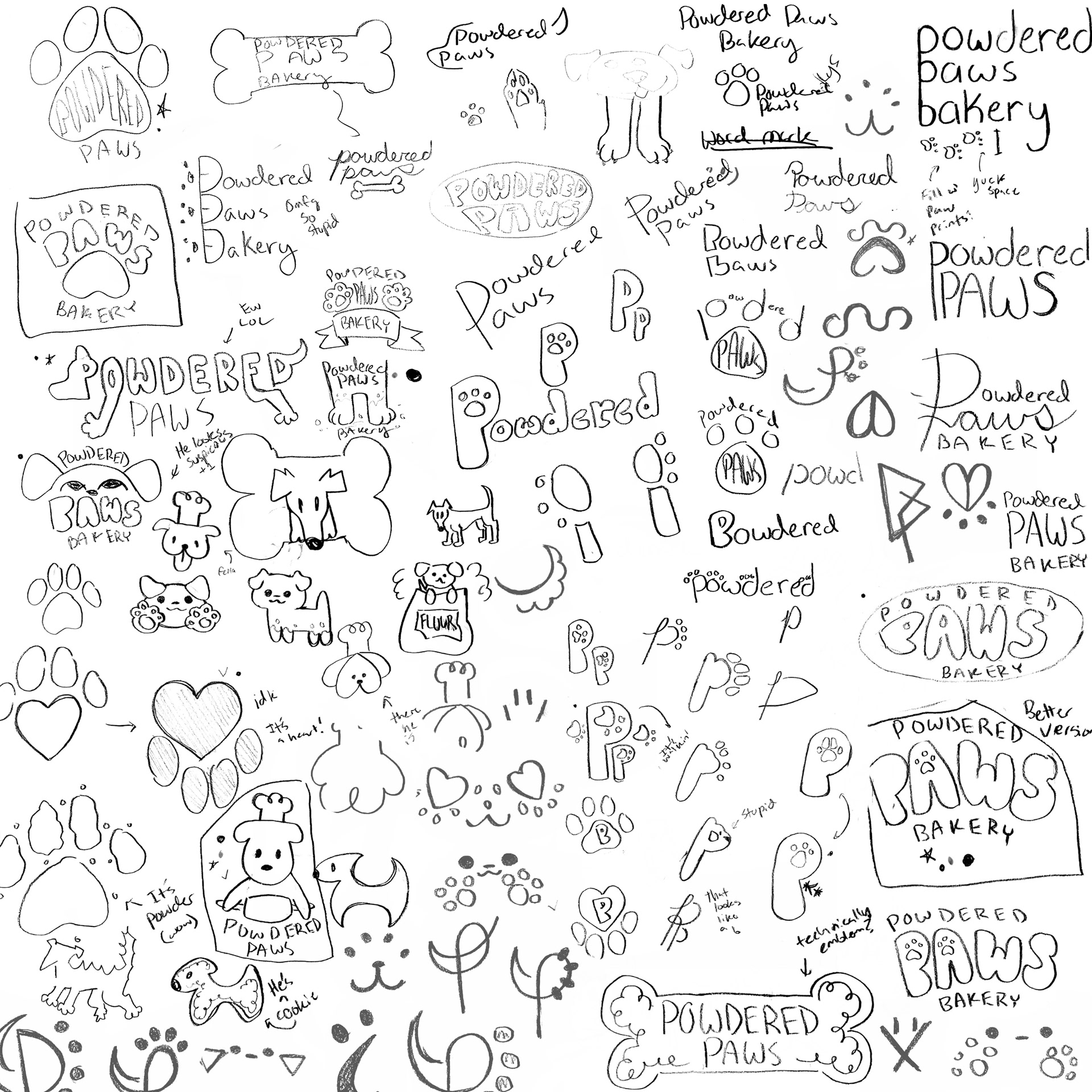
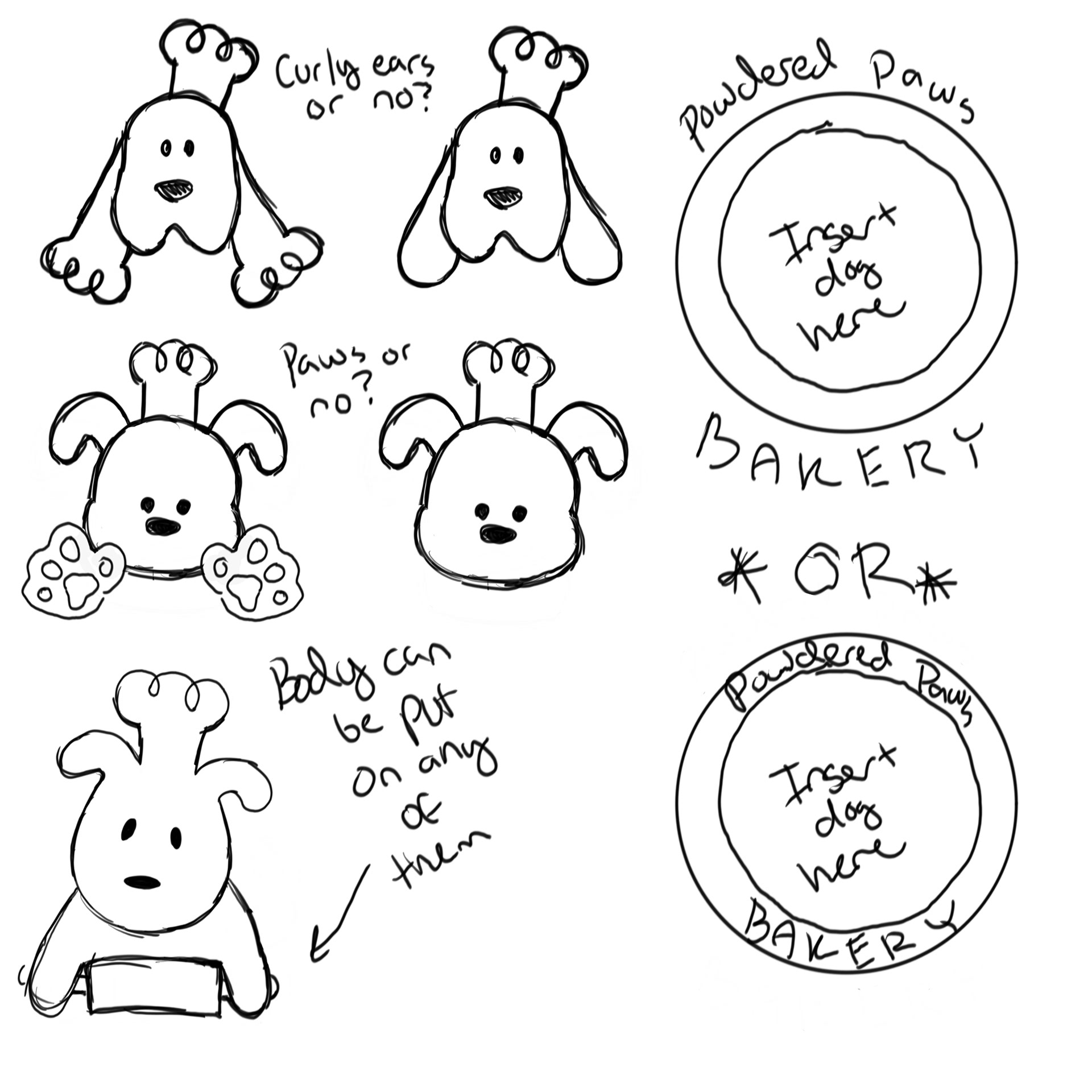
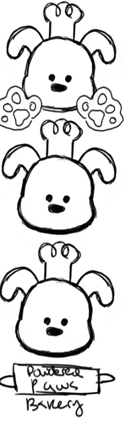
Several variations of logos were made before I landed on the dog mascot motif. Throughout this process I was concerned about the "people" aspect of the brand not coming through. This was not resolved until nearly the final resolution as I continued to work through iterations.
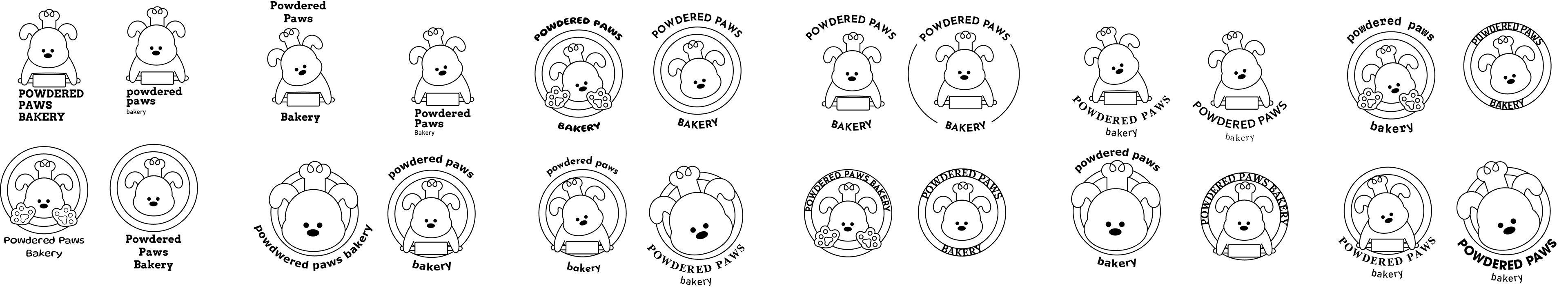
Once I decided on the character design, I need to determine how to best represent him. He is meant to look as round and friendly as possible to appeal to my target audience. The slight tilt of his head gives him more personality and help him look less stagnant.
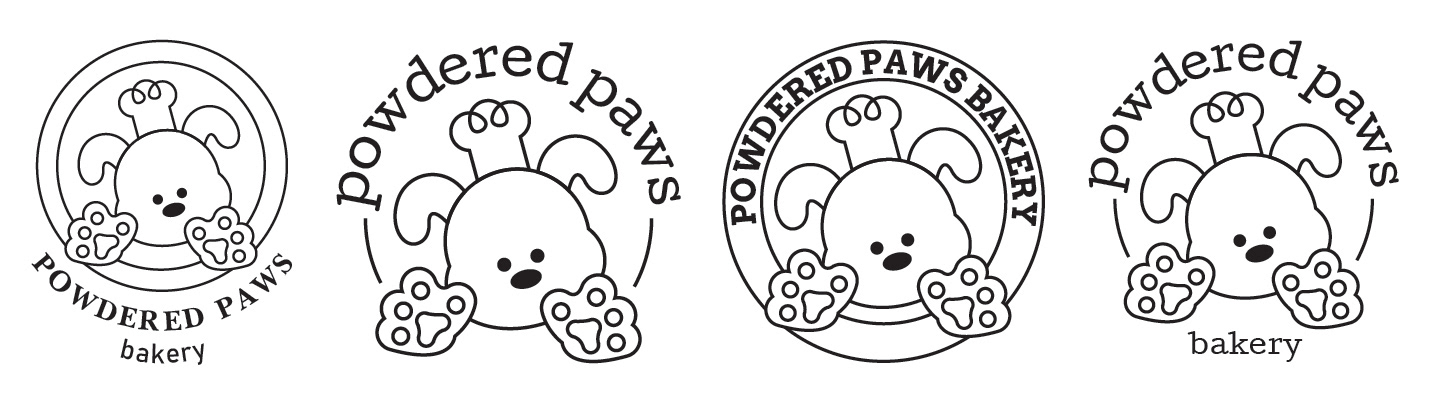
After establishing the illustration, I moved on to fonts. I wanted a friendly but clean looking font, as my logo is already quite silly. I chose Cutive for its friendly serifs and handwritten appearance, and mulish for its legibility and roundness, even in all caps.
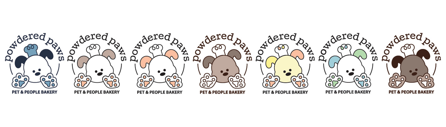
The colors took a lot of iterations. I couldn’t decide between a comforting natural chocolate or classic candy-coated pastel colors. I decided to go with black for legibility and to ground the logo, and pink and yellow to make people hungry, but also invite them in. His paw pads are white to represent the powder, and humorously imply that he is the chef with his hat and floured feet.
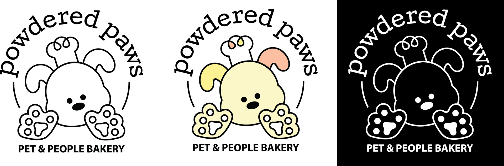
The final Powdered Paws logo in black and white, color, and reversed versions
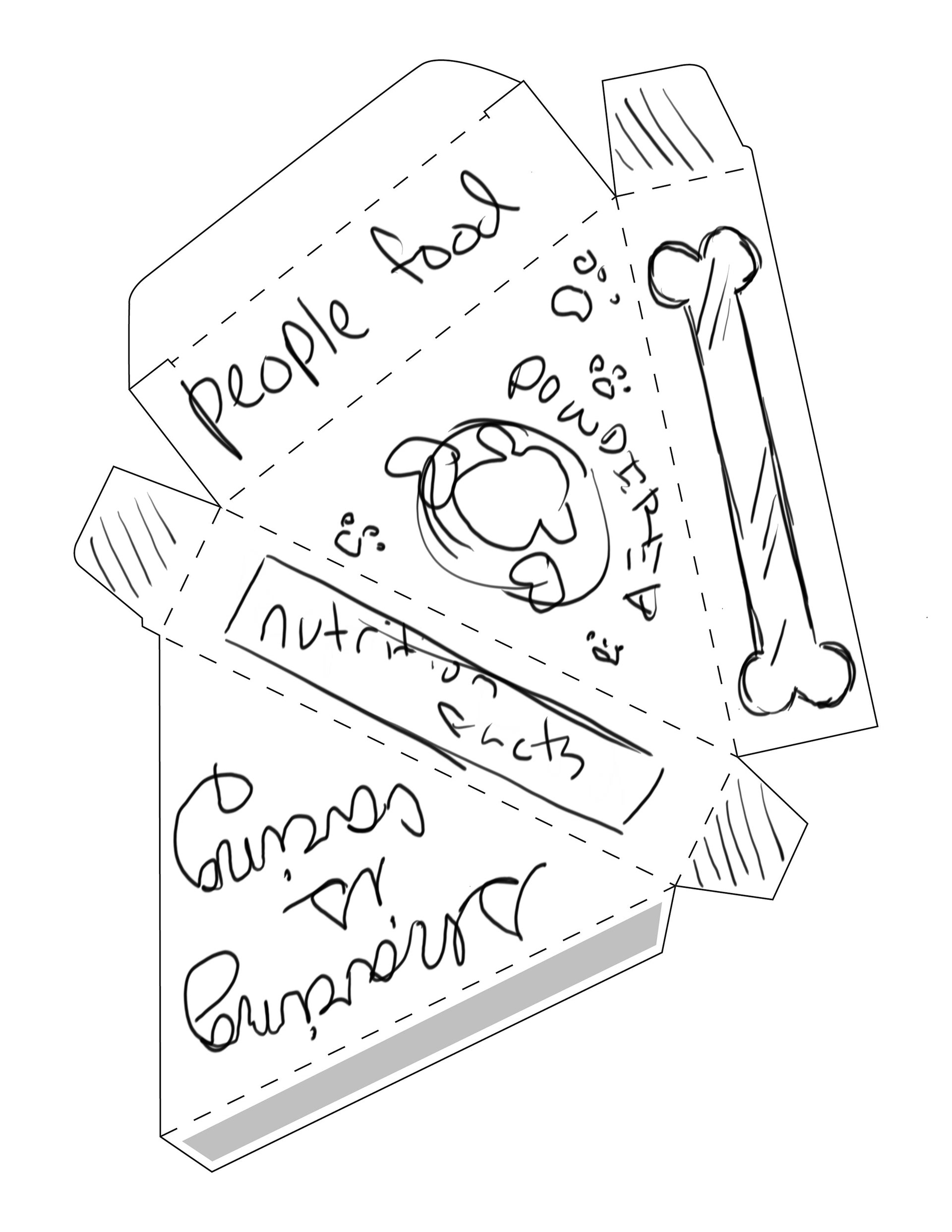
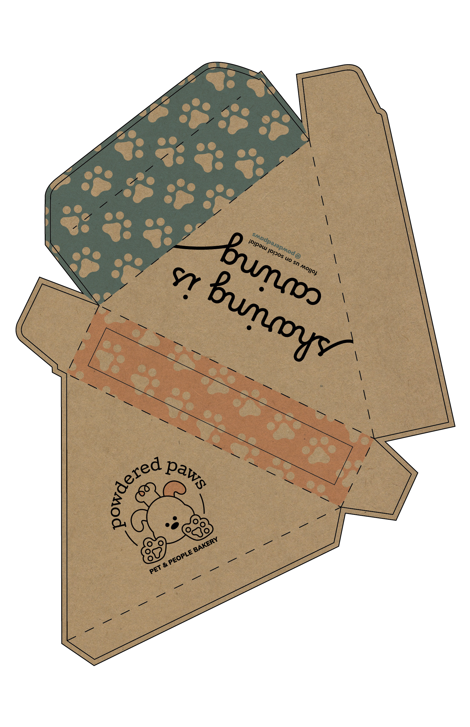
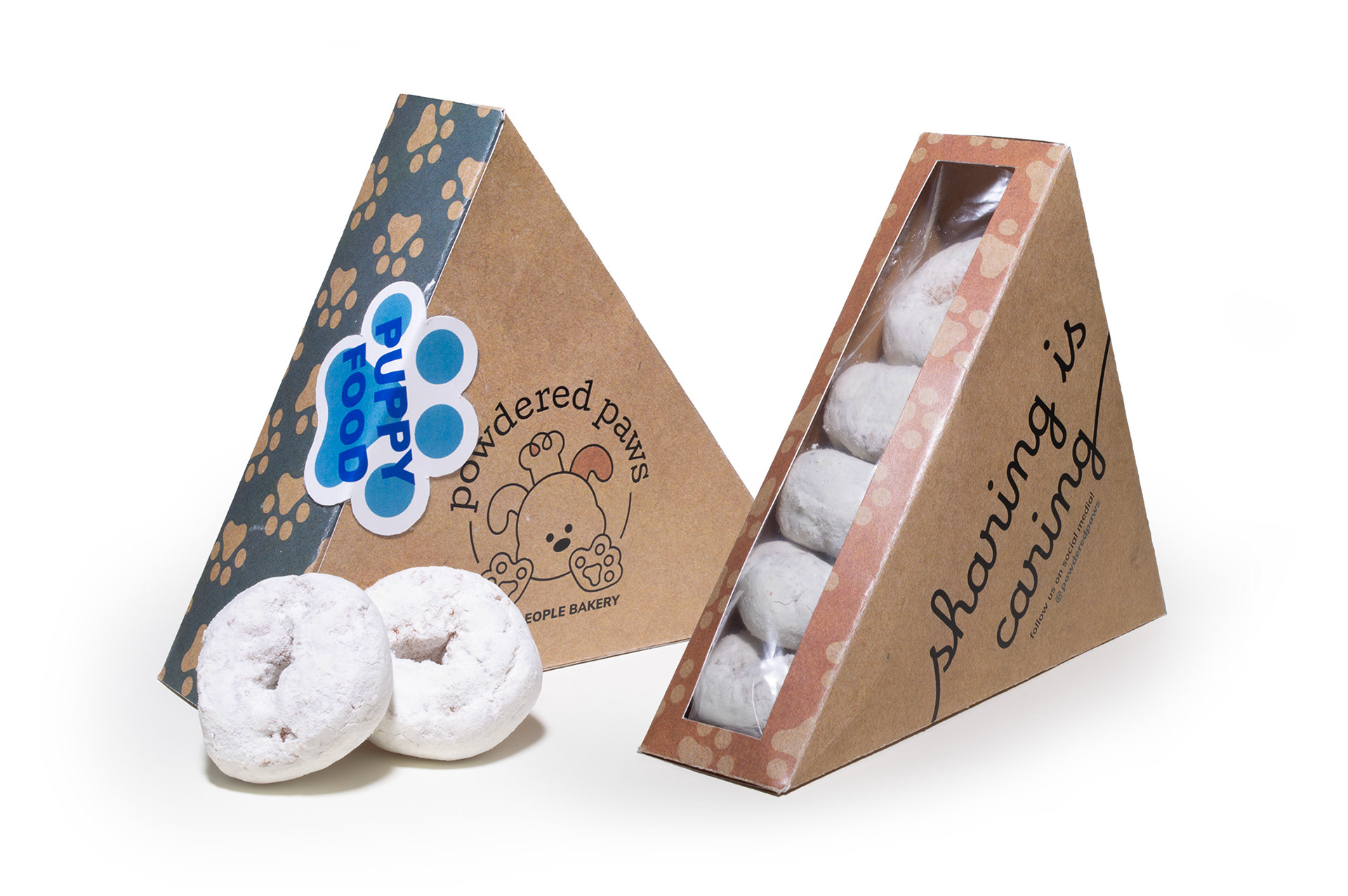
From sketch to mockup, Powdered Paws' environmentally friendly packaging ensures that human and pet treats won't get mixed up thanks to labelling stickers. The box can also be fully opened flat to make a plate for your pet, and is resealable. The box includes a window for extra insurance against a mix-up, and social media handles for that extra connection to the customer.
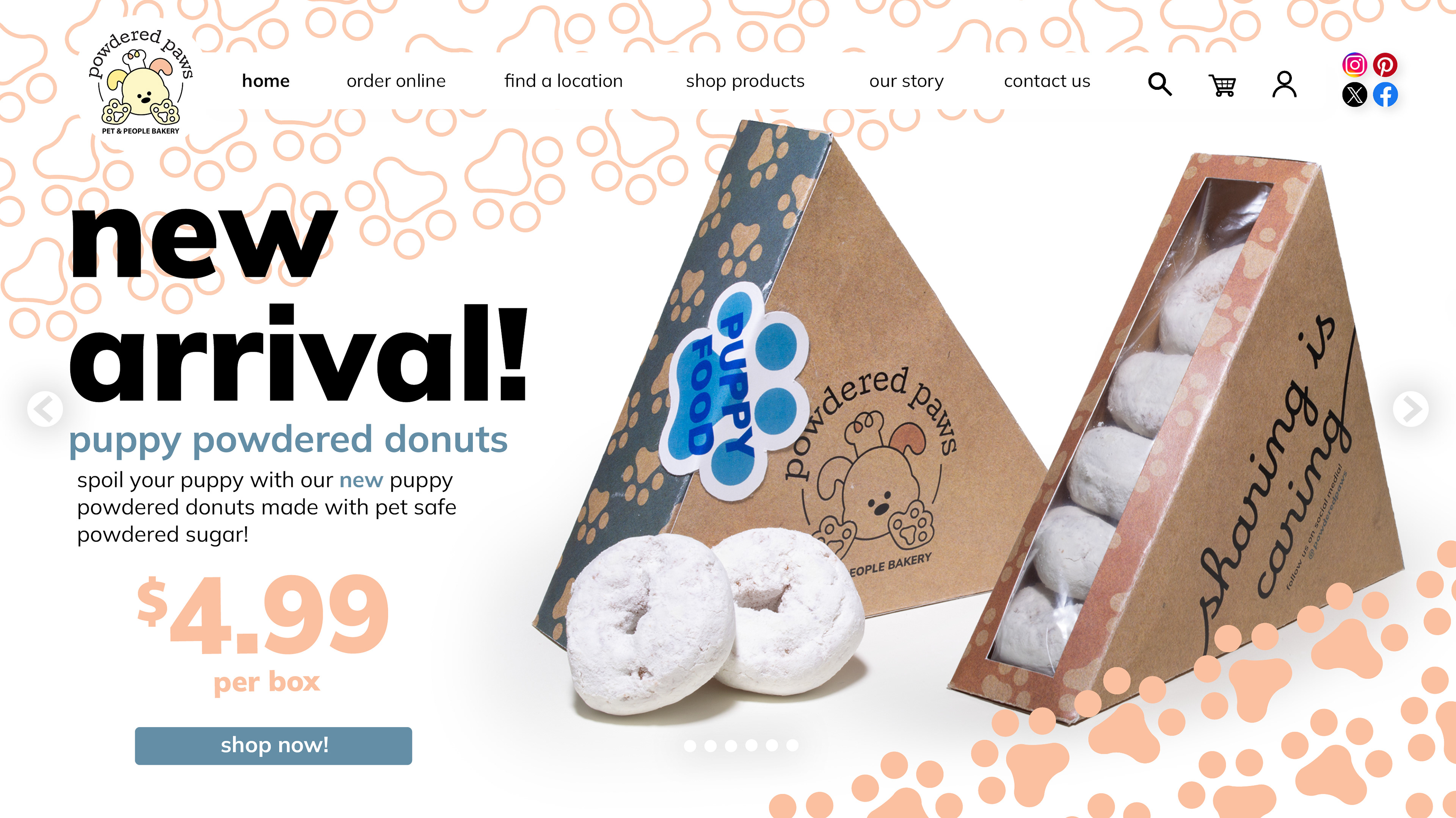
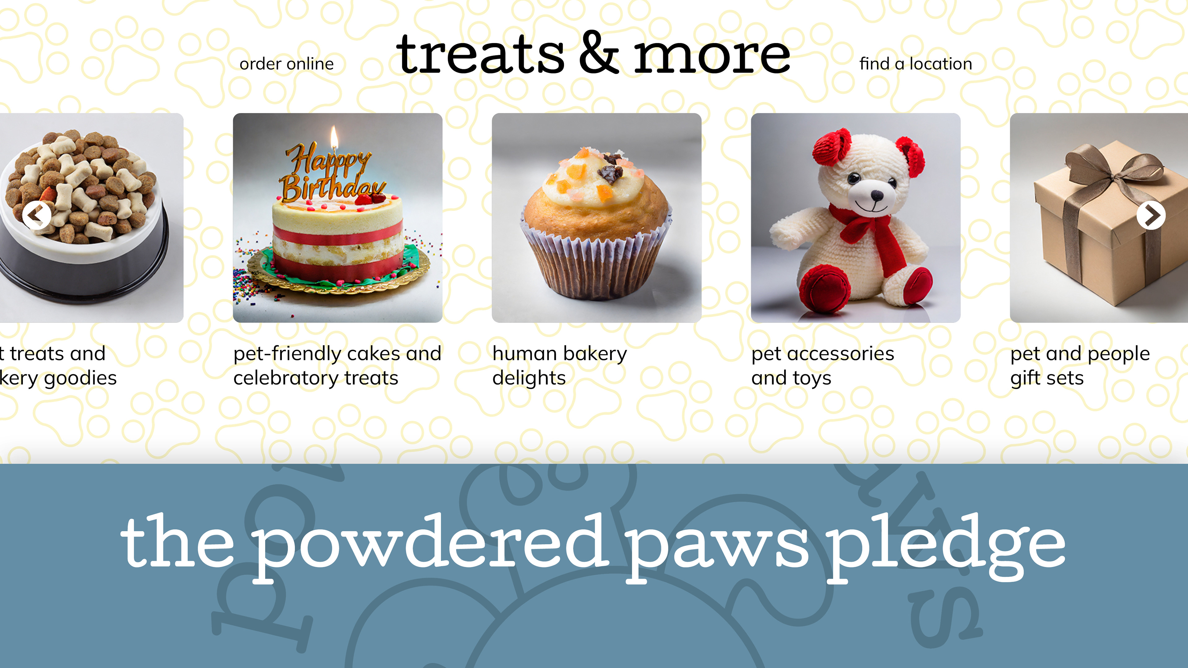
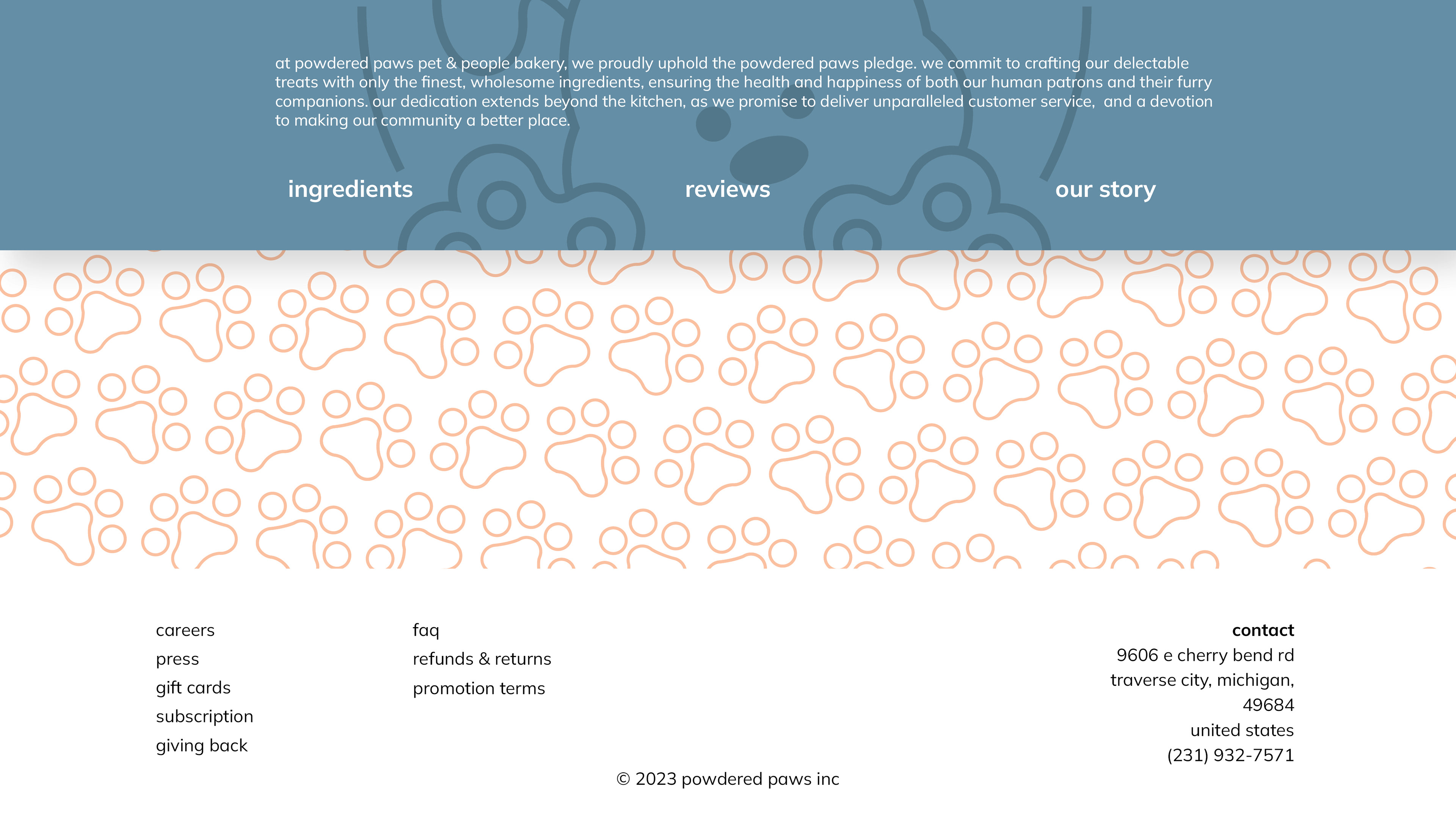
Powdered Paws' home page features a cycling splash screen at the top which promotes various CTAs, shop categories to get customers immediately interested in the product offered, and the Powdered Paws Pledge, which ensures customers of the quality that they are receiving.
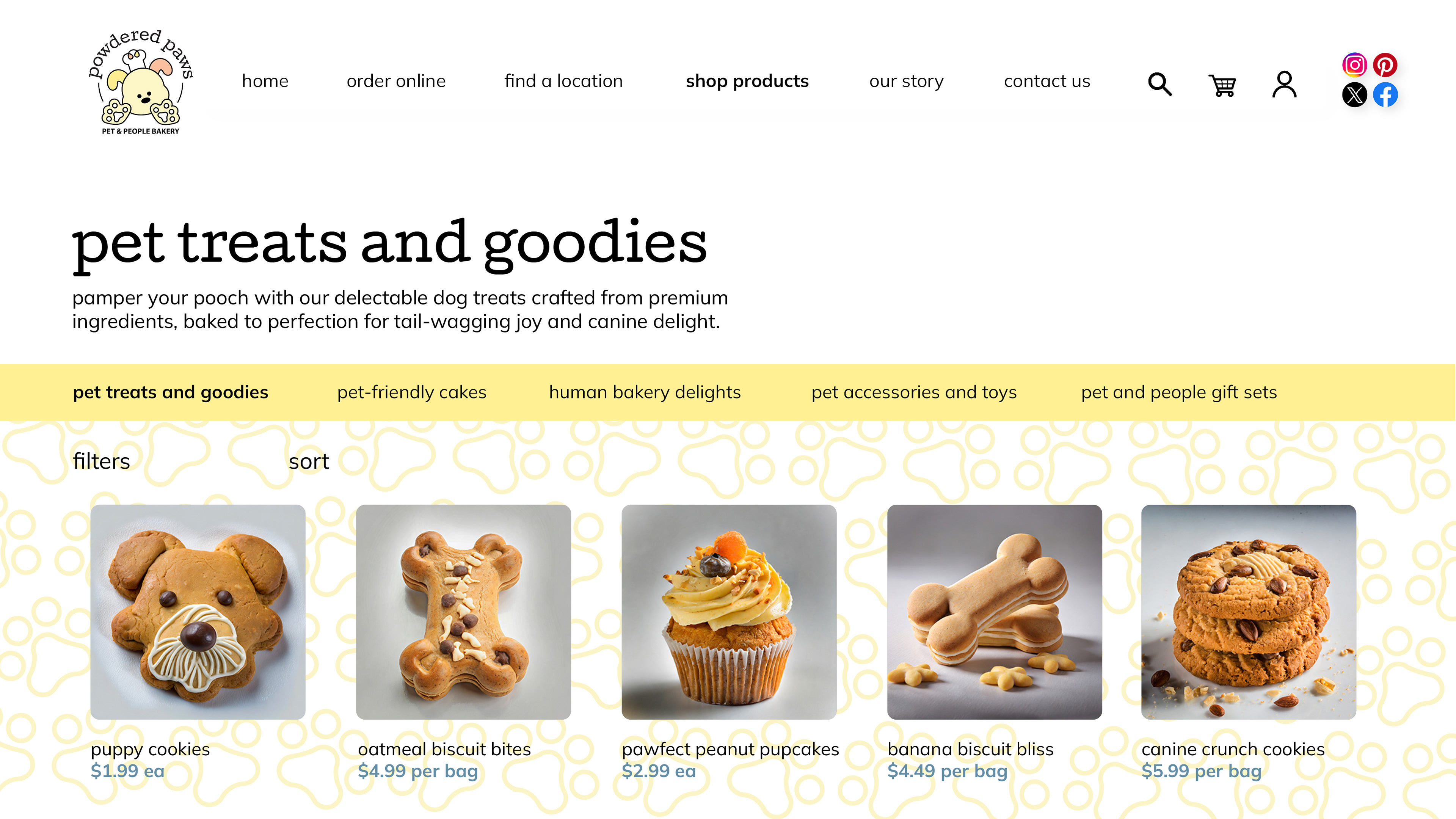

Two other pages featured on the website, which can be found through the navigation bar or through various points on the home page. They include a shop with categories and the about us page, which makes a human connection with the customer through storytelling.
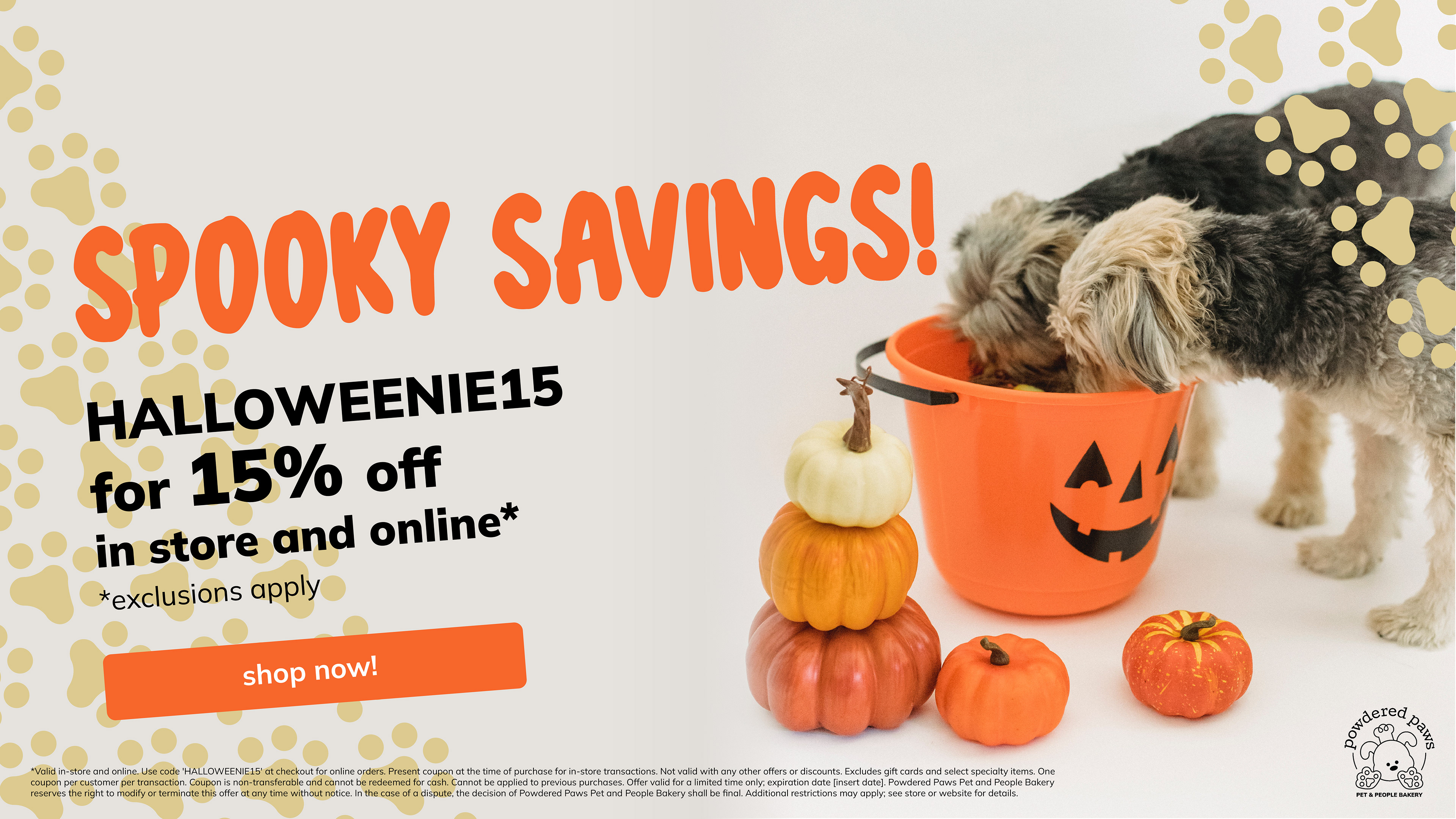
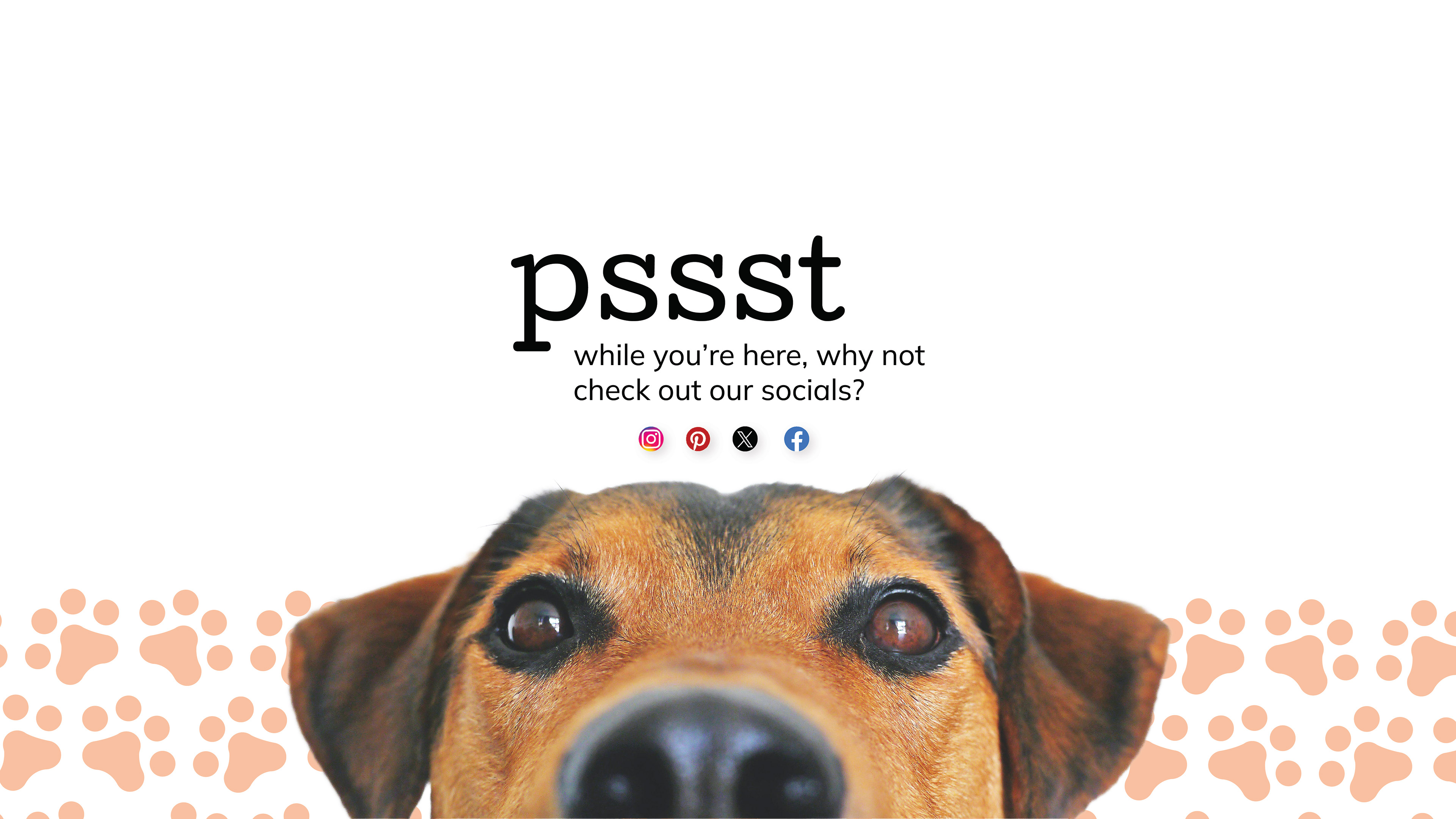
Two more examples of splash screens that would be featured at the top of the home page, one promoting a holiday sale and the other promoting social media.